Creating homepages that engage your visitors might seem easy, or at the very least something that you are already doing. In reality, most homepages lack the necessary components to be an engaging and converting homepage. You can run a check on your homepage by performing a few simple tasks that we will cover in this article. Begin by visiting your homepage, and ask yourself the following series of questions. Is my homepage following these rules? Am I currently getting the conversion percentage I want? What can I improve, and how can I go about making these improvements.
This article will focus on four main points and one bonus point that you can use to enhance your homepage and conversion rate greatly. We will cover navigation, Calls to action or CTAs, Design elements, and content. And at the very end, we will touch upon one bonus topic that can provide an instant boost to your website’s ranking on Google.
Homepage That Engages: Website Navigation
The navigation of your website plays a vital role in creating a homepage that engages your visitors. If your customers can’t get what they need in three or fewer clicks, then you need to rethink your website’s flow. A simple rule you should be following is the three-click rule. Customers need to be able to get whatever they need right away. The longer they have to look around, the more likely they will leave your websites and end up on a competitor’s site.
If you want to check out a quick and efficient homepage, take a look at Amazon. You can get any product you need in just a few clicks. If you are a campground owner looking for an example, you can check out rvResortScout. We make sure our visitors can find the campground they are looking for and get all the information they need before making their booking. As an exercise, take a trip over to your homepage. Now see if your customer would make a booking or find whatever product or service you are selling in three or fewer clicks.
Calls to Action That Truly Work
Calls to Action or CTAs are an essential and often overlooked part of any homepage. Visitors need to be told what to do and where to go. As humans, we are always looking for instructions and pieces of information that keep us on the right track as we try to accomplish a goal. Having clear and visible CTAs not only points your visitors in the right direction but allows them to feel as if you are guiding them step by step to their ultimate goal. When writing your CTAs, they need to be concise and straight to the point. For example, a “Buy Now” or a “Download Here” button are excellent examples of CTAs that generate good results. More powerful CTAs may include:
- Yes, We Can
- Make America Great Again
- Have It Your Way
- Keep Calm And Carry On
In all of these Calls to Action, the common denominator is short, concise, and straight to the point. They allow their readers to know exactly what they should be striving for and what to expect. While some of these CTAs are more political in nature, you can still see how they prompt people to take a certain action. Burger King’s “Have it Your Way” gives customers a sense of freedom regarding their food choices. Knowing that your customers can get what they want and how they want connects you to them on a more personal level. If you are a campground owner, perhaps your CTA could be centered around a major amenity you offer. Or even a statement about the land surrounding your park. Take a trip over to your homepage and see what you are asking your customers to do. Do you have a powerful CTA on your homepage? If not, think about adding one right away.
HomePage That Enagegs: Design to Hook Them In
The next important topic we will be discussing designs. Good website design can be extremely costly, but using a few tips and tricks, you can start to optimize your website’s design. Efficient use of whitespace is one of the most underrated aspects of good website design. Adding whitespace not only allows a break for your reader’s eyes but also draws attention to the most important features on your website: the CTAs and other important design elements. More advanced design work such as responsive design (elements that move as you hover over them) can also be added. We suggest that you stay away from such features unless you are an experienced web-designer as they can do more harm than good if done incorrectly.
Branding
Besides whitespace, your homepage’s layout and branding play a vital role in having an engaging homepage for your visitors. Your brand element should be easily visible but not take up too much space on your homepage. Therefore, you should place your brand logo on the top left corner of your homepage. This allows your customers to know they are on the right website and begins to build a connection between you and your customer.
Ideally, you want to get to the point where all your customer has to glance at your logo, and they will be able to identify you immediately. Some companies have done this so well that all you might have to see is a red can and immediately associate that with coke. Your homepage is your opportunity to begin building that connection. Take a moment to check out your homepage and see where your logo is. Is it taking up too much space? Is it visible? Do you think the majority of your customers would be able to identify you simply by looking at your logo?
Quick Analysis
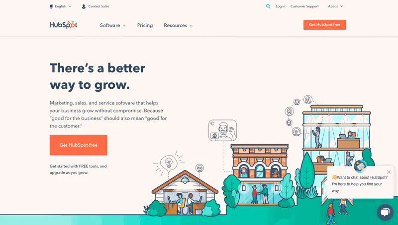
Taking a look at HubSpot, we can see they took the time to plan out their content. They are also making use of CTAs, amazing design work, and easy navigation. For now, let’s focus on their content. Prominently displayed, we are shown the title “There’s a better way to grow,” which immediately captures the visitor’s attention. Most people who are looking to build their brand and grow will be drawn in. They then follow up this title with a quick explanation of what they provide and how it can help you. Finally, they use a simple CTA to hook their visitors “Get HubSpot free.” Of course, everyone loves free, so why not give them a try.
Now think about your website and the content that is displayed on your homepage. Are you using catchy/informative titles? Do you give a quick description of what you have to offer? And is your CTA powerful enough to get people to click into it? If the answer is no to these questions, you need to go back to the drawing board and make these changes. Failing to do so could be costing your business thousands of dollars a month.
Bonus Item: Loading Speed
The faster your website loads, the better. Not only for your customers but Google as well. Google likes fast, and if your website isn’t meeting Google’s standards, it’s going to cost you. Even if everything else on your website is great, a slow-loading homepage can signal to Google that you don’t deserve to be ranked in their search engine. So for this to be effective, your homepage needs to load up in less than 5 seconds. Ideally, 2 seconds or less. Boosting your load time can be one of the easiest ways to increase your ranking in Google.
Increasing your loading speed generally comes down to a few major factors. The first being pictures and videos on your homepage. All of this content must be optimized. Several plugins can help you do this. Having clean code and removing plugins that are no longer in use are also ways to increase your load speed. If you are interested in having a free walkthrough of your website, schedule a meeting with our marketing team. We can go through the basics of increasing your website’s speed and some other important factors.
Homepage That Engages: Basics Covered
If I’ve done my job right and successfully covered these topics, you should have a basic understanding of what it takes to create a homepage that not only engages your visitors but helps convert them into customers. Taking the time to craft well-written content, make use of design elements, powerful CTAs, and the navigation rule will help take your homepage to the next level. Couple that with our bonus tip, and you are virtually guaranteed to see an uptick in traffic and overall sales.
If you’re interested in having our marketing team look at your website to help you design your homepage, you can schedule a meeting. You can expect a quick 15-20 minute walkthrough of your site and the potential changes that will be happening. We will also be covering our featured “Directory Service,” which helps boost your own personal website and gets you listed on a fast-growing RV directory.