

Grabbing your customer’s attention is no easy feat in this day and age, with them being bombarded by ads, constant dings on their phones, and just everyday life. As a matter of fact, my phone has dinged 3 times since I began writing this article. These distractions are out there, and they are here to stay. So what can you do as a business owner to make sure you have awesome homepages that attract and hold your customers on your website?
While there is no certain recipe for success in the online landscape, there are a few things you can do to get you closer to your ultimate goal. When you land on an awesome homepage that is both engaging and easy to follow, you generally oblige and keep moving forward. On the other hand, when a homepage is dull and had no clear sense of direction, you will back out almost instantly. The same thing is happening with your customers each and every day.
While it is impossible to keep everyone on your website, you should strive to keep as many people as possible there. Not only does that guarantee you are getting the most out of your website, but it basically guarantees your website is making you the most money possible. A well-built homepage will have a few key characteristics that make it that perfect landing spot for your customers. In this article, we will cover what ideal homepages have in common and what they look like. If you’re interested, we also have a quick 5-7 minute read on how you can create these engaging and awesome homepages. You’ll get direct tips on implementing many of the topics we will be discussing in this article.
Awesome Homepages: Example We Will Use
In this article, we will focus on one of the many websites that create extremely awesome homepages. Homepages that lead you right down their conversion path. And ultimately get you to do exactly what the creators of that homepage intended on you to do.
Our go-to when showing customers what an excellent homepage looks like is HubSpot. One of the world leaders in Marketing, CRM, and Sales Management. If you want a direct link to their homepage, you can check them out right here. Otherwise, follow along as I point out the most important aspects of their homepage and how you can “copy” the techniques they use to get similar results.

Hero Section
The hero section of your homepage is what whoever is landing on your page will see first. This gives off the first impression and often is what will directly lead to them either staying or “bouncing” off your homepage. The moment you land on HubSpot’s landing page, a few things jump out right away. There is a clear title and an indication of what you can expect from their services.
The title is front and center and states, “There’s a better way to grow.” Clear, simple, and to the point. They are letting their clients know that you can expect to grow your business by partnering with HubSpot. Atop their homepage is a clearly defined section that allows you to explore HubSpot in totality. You can check out the pricing and learn about the software they have and how it can assist your business.
Their homepage has a call to action, “Get HubSpot for Free” there is nothing better than free, and HubSpot is offering up a free tools package so you can get an idea of what they can do for you. Beautiful yet simple imagery flows throughout the page showing you how HubSpot is interconnected throughout your whole business.
Further Layout of Their Awesome Homepage
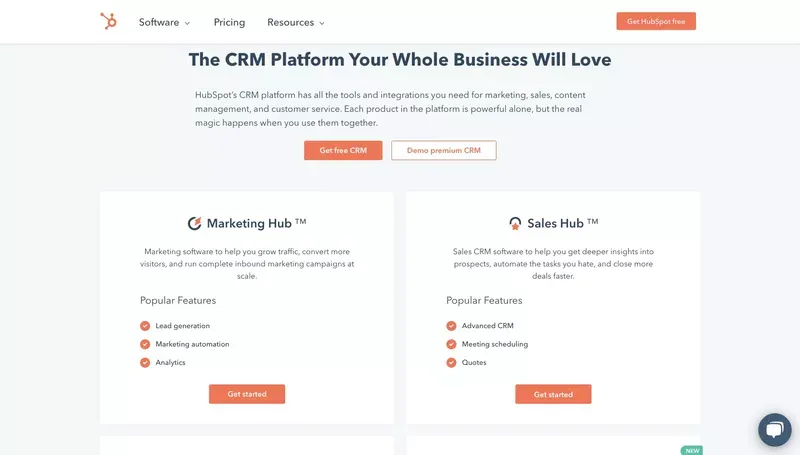
Scrolling down their homepage, you get to see all of their offerings and some of the most popular features each one of their services has to offer. This could be similar to listing the types of campgrounds and what you can expect from each type of campsite on your website. Notice how they don’t dive into the specifics of each feature. Instead, they give a brief overview of each feature and allow you to look further into each one if you wish.
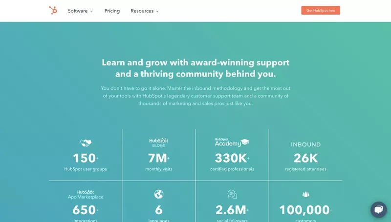
Finally, they wrap up their homepage by using some testimonies and numbers to prove their service work and partners. Always show social proof and testimonies when you have them. They can go a long way in gaining potential customer’s trust. People tend to believe other people’s reviews of a business, and if you have positive ones, don’t be afraid to put them out there for people to see.
Bonus Tip: Never forget to add the Privacy Policy, Disclaimer, or any other policies your site may have in the footer.
Graphics
Your homepages graphics go a long way in providing continuity and an overall pleasant experience when visiting your website. Having a strong brand and following certain guidelines you set for yourself will help you build trust and engage the customer on a deeper level. Using our HubSpot example, we notice a few elements that all websites should follow. Their logo is present in the upper left-hand corner of their screen, and all text/images follow their color guidelines. HubSpot uses a predetermined set of colors that they will always use for their text, logo, and branding/marketing efforts.
Continuity is key across all platforms. Doing this on your homepage is essential. In some respects, it even makes your life easier. You don’t need to worry about which colors for fonts you will be using, the types of fonts you will be using, or which colors you should be using in all your design elements. All of this will be predetermined by your brand and the colors your brand follows. As you can see, HubSpot uses the same colors throughout its homepage. Orange and dark blue make up most of the homepage, with some stylistic exceptions found in some places. The exceptions are in the form of white letters found throughout their homepage. While this may break from their traditional dark blue letters, it does not detract from the overall “feel” of the website.
What Happens When You Don’t Have Continuity?
When you do not have continuity across your brand, you run the risk of being seen as inauthentic. You might not seem trustworthy or professional if you use random colors throughout your website. People have been conditioned to expect certain things when they visit a homepage. A professional-looking page with all the information they need on it right away. People know that if they scroll down a homepage, they can expect some additional details. If these elements are not well-connected, you will lose your audience. Pay special attention to colors, word choice, and design elements when crafting your awesome homepage.
Copy
All awesome homepages have the same thing in common: amazing copywriting. The power of copywriting simply cannot be understated. Good copy engages visitors, tells them what to do, and gives them all the information they are searching for. Good copy is not simply limited to your blogs and marketing pieces. It should be everywhere throughout your website, including your homepage.
Taking a look at HubSpot, we notice some amazing content written in a straight and to-the-point fashion. Directly underneath their title for the page, they have listed “Marketing, sales, and service software that helps your business grow without compromise.” This simple line lets readers know right away what they can expect from HubSpot. Similarly, it would help if you told your visitors what they could expect from you right away on your awesome homepages. The goal is for your visitor to take action. Be clear with your message and prompt them to take the next steps.
Call to Action
Having a clear Call to Action or CTA’s is vital to the success of your homepage. CTA’s can be simple yet very effective. They can be in the form of a “Click Here” button, “Sign Up for Free,” or even “Get a Free Night on Us.” All these would be effective examples of CTA’s that engage and get your visitor to interact further with your awesome homepage.
Looking at HubSpot’s homepage immediately, we see a few CTA’s that jump out. “Get HubSpot Free.” As a potential client visiting their website, this is the perfect CTA for them. Getting a free trial of the software they are interested in purchasing is the perfect way for them to get to know HubSpot’s capabilities. Similarly, as a campground owner offering one free night on a 7- or 14-day stay could be the perfect way to entice potential customers in to try out your campground.
Scrolling further down their page, we see a few more CTA’s asking their visitors to “Get Started” on the service of their choice. None of their CTA’s are annoyingly big or in your face. Instead, they are placed perfectly with the page’s design and allows you as the visitor to easily look around and click them when you are ready to give them a try.
Social Proof
Having social proof greatly adds value to your website. People trust other people’s reviews and often trust what other people say about the business over what the business says about itself. This is why online review sites such as Yelp have become so popular over the years. Showcase your success and have a page where your visitors can see testimonials given by previous customers.
HubSpot does this elegantly at the bottom of its homepage. They give numbers to show the number of users they have, how many social media followers, and how effective their platform can be. The only thing in my option HubSpot could have done slightly better shows real-life testimonials under this section. Therefore, never underestimate the power your current customers have on the outlook of your business.
Business owners often have a tough time getting reviews for their services. In reality, the easiest way to get this accomplished is to ask your existing customers for reviews of your service. You can do this in exchange for a percentage off their next stay or simply as a favor you ask of them. In our experience, we find that people are more likely to give a review when they are offered something in exchange. We have this quick write-up on reviews and “Protecting Your Campgrounds Reputation.” This will give you a few tips on dealing with the reviews you receive.
Awesome Homepages Don’t Happen Overnight.
Creating your homepage comes with a lot of work and planning. Having a team of individuals with experience in creating converting homepages goes a long way in your business’s success. When you have the ability to engage your visitors, your website becomes a potent tool and your most powerful source of revenue. Not having an effective homepage can be costing you tens of thousands of dollars through the course of a year.
The team at rvResortScout specializes in creating awesome homepages for our clients that are virtually guaranteed to increase the number of conversions you get from visitors who land on your homepage. Have a team of professionals work on all the steps listed above. You sit back and reap the benefits while focusing on running your campground. So, let us deal with all the planning and meticulous work that goes into creating a truly amazing homepage. If this is something that sounds of interest to you, schedule a meeting with our marketing team today. You will have the ability to ask questions and partner with one of the fastest-growing RV marketing agencies anywhere.


