Consumers are well-known for their strong connection with colors while making buying decisions. Every day companies use this to their advantage to get their users to make purchases, shape the view of their company, and highlight key components about their business. Color psychology marketing is a well-studied field and can provide promising results for your company if used to your advantage. This article will briefly overview some of the most commonly used colors and how they will affect your customers. The psychology of colors in business is not an exact science. However, following the tips laid out in this article has many benefits for your business and website design.
Each of these colors has a positive effect and a negative effect attached to it. Using too much of a color can steer the customer in the wrong way. For example, red can evoke excitement, energy, and urgency. But on the flip side, too much red can signal danger, stay away from me, and anger. Using each color in the correct balance allows certain companies to become so much more successful than others.
Blue: Color Psychology Marketing In Action
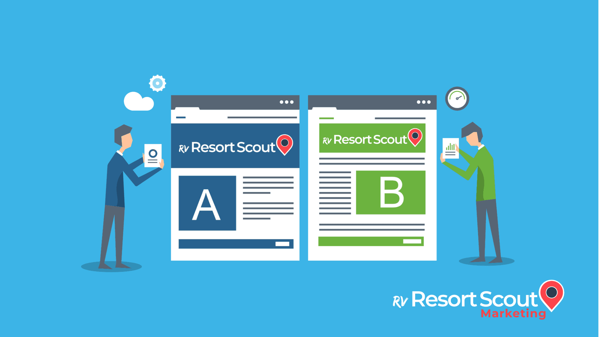
Blue is a popular color that businesses use when doing marketing campaigns. One advantage of blue is its familiarity with consumers as a color – nearly 80% know the color blue from brands they associate with it. We'll cover the benefits it provides below. It represents professionalism, security, and credibility. For this reason, many security companies and healthcare companies chose to go with the color blue. Some examples include the Blue Cross and Blue Shield of Florida, Leon Medical Center, and American Express, which secure all their client's information. If security and trust are the underlying signal you wish to convey to your target audience, having blue in your company logo will go far.
The dark side of blue includes feelings of sadness. Hence the expression “feeling blue,” weight loss (which can be positive depending on your industry), and a feeling of aloofness. Be careful using too much blue, or these are the effects that will shine through. If not complemented with a series of other colors. Balance is key and will be a common theme throughout each of these sections.
Red: The Powerful Motivator
The color red is one of the most powerful, if not the most powerful, color psychology marketing offers. Red is flashy, red is bright, and red catches attention. Many sports teams, fashion icons, and films highlight the importance of messages by using red. As mentioned above, red will create urgency, provide energy, and bring excitement to anything it touches. rvResortScout uses red in nearly all of our marketing efforts and throughout our website to convey our excitement for our brand and what we have to offer. Other popular brands that use red include McDonald's, Marvel Studios, and the Atlanta Braves. Each of these brands uses red in a different amount to bring excitement to their brand.
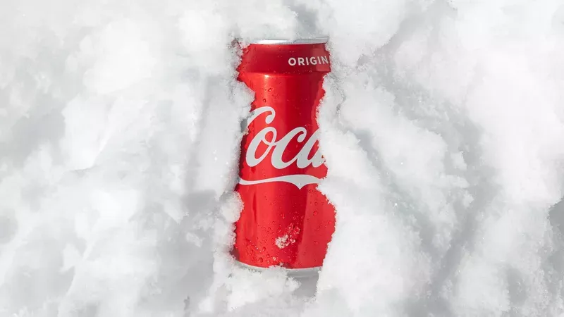
Red can also detract from your message in a damaging way. It can convey anger, fear, and rage if used too much. Red is the hue movies use when a scene is scary. Demons and other evil characters, most of the time, are red. Red has a sinister side that needs to be contained in your branding. Using the right amount can provide amazing results. Going overboard will lead your customers to jump ship.
Green: The Relaxing Color
Green is probably the color that needs the least explaining. It represents relaxation, good health, nature and compliments outdoor companies extremely well. As an RV directory, we often suggest that our campground owners use at least a bit of green on their website or in their logo. Green is also a motivator, a start to something, and similar to the color blue, represents relaxation.

Color psychology does not typically see green as a "negative" color, but we all know of one phrase that has caught on with it. The saying "green with envy" has followed the color. Furthermore, we often associate green colors with feeling unwell, i.e., portraying characters as green in cartoons, it usually means they're starting to feel sick. As with all the colors, implementing them in the right amount can produce immediate positive effects for your business.
Orange: The Friendly Color
Few colors in color psychology marketing are as friendly as the color orange. In fact, the color orange is in many children's activities, physical challenges, and fitness-related goals. It represents warmth, positive energy, and taking action. Using orange in your branding can promote these characteristics and make your brand an overall more friendly place.

As with every color, orange does have its drawbacks. The color orange is often interpreted as too flashy, proud, self-centered, and reserved. Knowing how the psychology of colors in business plays a role on people, having too much orange can be a downfall. Imagine a company that prides itself on being humble, kind, and people-friendly, but unbeknownst to them, they have too much orange in their logo. Subconsciously they will be giving off the exact opposite signal of what they wish to achieve.
Black: The Elite of Color Psychology Marketing
Using black in your brand is a signal to the elite that this product is for them. Imagine goods such as black cards, a sleek all-black car, high-quality leather shoes, or things of that nature. Black is an automatic signal that this brand sells elite quality items and is most likely for a steep price. If this is not your target audience, then we suggest staying away from using this color. Lastly, black conveys power and sophistication. If you’re a high-end campground or another service providing high-end goods, this color is for you.

Now, here's the issue with black. Black isn’t really a color. In fact, it is all the colors or the absorption of colors. Want to learn more on this topic? I would suggest this terrific article by Kendra Cherry. Black is commonly associated with darkness, death, decay, and in many cases, evil. Enough black, and you can evoke feelings such as anger, sadness, and fear. Black, in fact, has earned many expressions associated with it, such as black-heart, black sheep, black magic, and the black plague. Nevertheless, businesses can use black to signal an elite quality item when used in the right proportion or signal to a specific quality.
Color Wrap Up
These are the most important takeaways from this article
- Every color represents multiple emotions
- Going overboard can bring out negative emotions
- Understanding the psychology of colors can be beneficial to your business
- Use the color your target audience will most likely associate with
We hope to have shined some light on the power of color psychology marketing and how you can use it in your business. We strongly suggest you follow this article up with our article titled “Why is Brand Personality Important.” Giving your brand personality offers a deeper connection with your customers and strengthens your overall image. Combining color psychology with brand personality will help grow your business to new heights. If you have any questions, please reach out to us in the comment section below.

