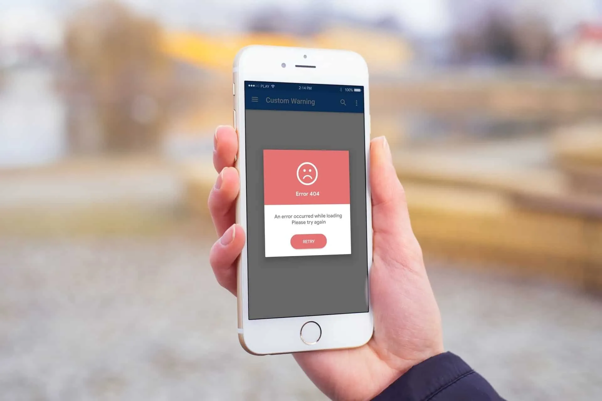

So you’ve created a beautiful website design full of bells and whistles that looks amazing on your desktop. To your dismay, when you load the site on your phone, it looks crunched, distorted, and nothing like the masterpiece you have created. Mobile web design mistakes are popping up all over the internet. Even the large companies such as Amazon and Facebook in their infancy were plagued with mobile design issues. New studies released by Google found that up to 66% of searches are done through mobile devices. So, what does that mean for you? Get to optimizing your website for mobile search.
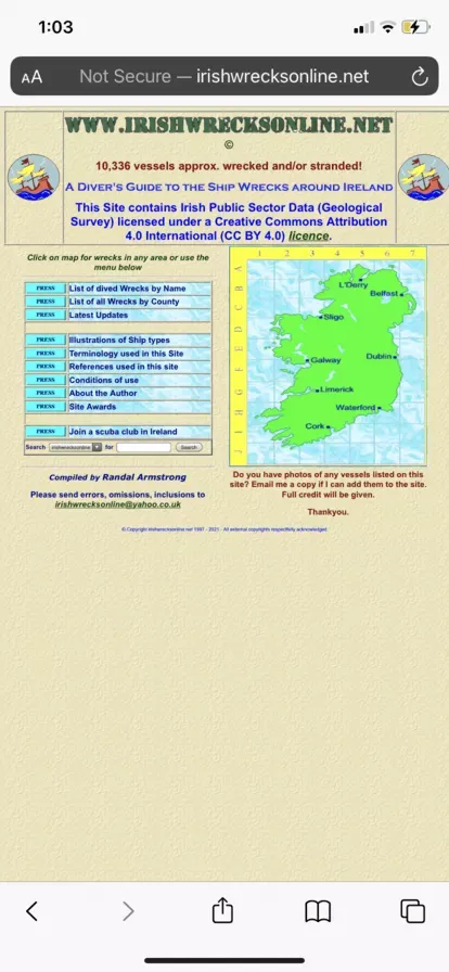
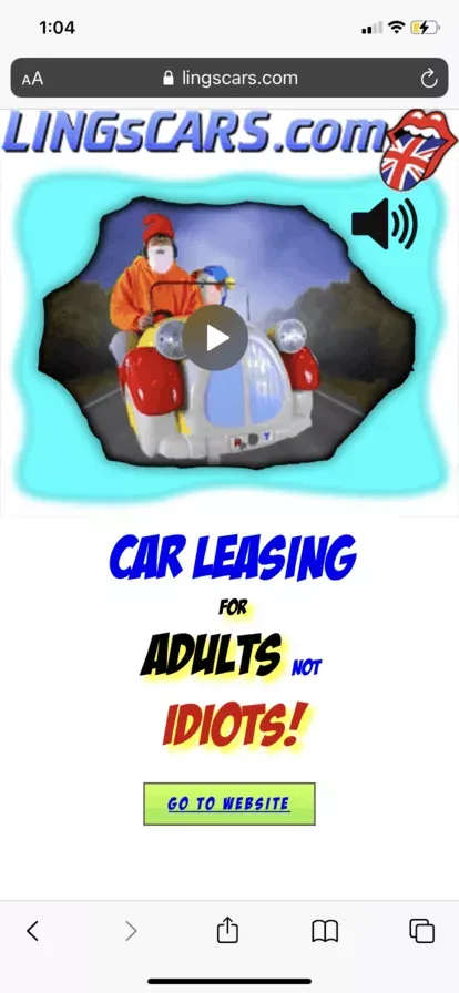
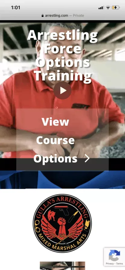
Trends show this number increasing in the future as people transition from desktops to more user-friendly devices such as their phones or even tablets (but that’s a whole other optimization story). The bad part is making mobile web design mistakes is pretty easy and common. Below I listed a few examples of some terrible websites I found after searching the internet for just 30 minutes. Some of these mistakes are more minor than others, but it proves that they do happen and can harm your website. Having mistakes takes away from the professional appeal of your website. It can even completely stop your visitor from finding the information they need.


Let’s quickly run through some of the most common mistakes RV campground business owners make when crafting their website designs.
Mobile Web Design Mistakes: One Size Does Not Fit All
It is often the case that website owners craft their website solely on a desktop and expect everything to fit proportionally on their mobile device. Unfortunately, it isn’t that easy. Good mobile website design will take key elements from your desktop design and do away with other elements that are not needed on the mobile platform. Understanding which elements to take away is a calculated process. Leave too much, and your design looks cluttered and unorganized. Leave too little, and your customer will be left wondering what to click next.
It can be helpful to list out exactly what you wish to achieve on each page and ensure that your customers can do that through both desktop and mobile web design versions. If they can’t, then you should make changes as soon as possible. We cannot stress the importance of testing enough. When we built the rvResortScout mobile version, we found error after error, mistake after mistake, until we could fine-tune our mobile design. Be patient, take your time, and reach out to professionals to get help when in doubt. Mobile web design mistakes have the potential to make or break your business.
Overcomplicated Menus
Menu placement, size, and shape are essential in mobile website design. Your users do not have the luxury of a mouse to pinpoint their click or a screen large enough to click what they are trying to click easily. This is why it is important to keep your menus easy to read, large enough, so they can easily click what they are looking for, and in a place on the screen that is user-friendly. Keep it simple. Think about the websites you are used to scrolling through on your phone. Amazon does an amazing job at keeping its users engaged with an easy-to-use menu system.
We want you to take a moment now and head over to your favorite website on your phone. Using the mobile version of their website, pay attention to their menu placement and how easy it is for you to navigate across it. If you don’t have a favorite website, you can always use Amazon’s mobile app. They have done a great job keeping their menu simple, easy to read, and extremely responsive.
Web Design Mistakes: Button Sizes
It is crucial that the size of your buttons are easy for fingers to tap. Remember, your users will not have the precision of a mouse that can easily click a small element on your page. Instead, your users will have to use their fingers (at best a stylus) to make their selections. Responsive easy to use buttons are the only way to keep your users on your webpage and happy with its performance.
When placing buttons, we suggest making them easy to see and taking up roughly 15-20% of the clickable area. I know this may seem like a lot but having easy-to-use buttons allows your visitors to glide flawlessly throughout your website. One way to make sure your buttons work and are user-friendly is to test them on a family member. Have a spouse, child, or other family member load up your website on a mobile device. Ask them to click a few things and then get some honest feedback. If they couldn’t click anything, you know you’ve fallen into this common web design mistake.
Elements Too Close Together
Another widespread issue is placing elements too close together. Your mobile design should be spaced out just like elements on your website are spaced out. Not leaving enough space between elements can lead to users mistakenly click the wrong button. It’s frustrating trying to navigate to a specific page, but you keep tapping the wrong area. Luckily this problem is easy to avoid with some well-spaced elements. This is one of the easier mobile web design mistakes to solve. It takes some intuition and patience to get the elements to sit where they should.
Some tips for solving this issue include:
- Using whitespace
- Well sized buttons
- Distinct page sections
- Don’t keep two buttons directly next to one another with no white space
Using Oversized Images
For first-time web designers, it is a common mistake to use oversized images. Images that work on a desktop won’t work on mobile unless they are properly sized for that platform. Sizing these images can take a bit of technical expertise, but if you’re willing to learn, many online articles show you how to size your images for use on a mobile platform properly.
When adding your images be sure to optimize and use files that are not large in nature. Using smaller files allows for faster load times which help your website rank higher in Google’s search results. In general, we suggest keeping your large images or full-screen background images should be no more than 1 MB. Most other small web graphics can be 300 KB or less in order to maximize load time and image quality.
One of The Biggest Mobile Web Design Mistakes: No Testing
We have briefly covered testing in the other sections of this article. But it deserves a section of its own. Testing is the most important thing you can do when designing a website, either for desktop or mobile. You can find the majority of these issues and work them out with good thorough testing. Unfortunately, many people fall into the trap of thinking their work is already flawless. With this type of thinking, you lose track of the basics and what helped you in the first place.
At rvResortScout, we suggest that our users double and then triple-check their work. First, check your own work. Be honest and notice where you can improve and what needs to be changed. Then have an unbiased third party take a look and use their criticism to make your design as close to perfect as possible. In the testing stage, it never hurts to test again. Even when you think you have a perfect product, it never hurts to give it one last look over.
How rvResortScout Can Help
For a limited time, we will be doing free mobile website checks. We will do a rudimentary check of your website covering some of the elements we talked about above. Once we complete our analysis, you will be invited to a one-on-one session with one of our professional web design team members. If you don’t want to wait that long, you are always welcome to schedule a call, and we can help you solve any of your mobile web design mistakes or other RV marketing needs.
If you’re interested in getting a free mobile check go ahead and send us a message. Be sure to include your name, campground, and the website you want us to check out. Soon as we can, we will reach out to schedule our meeting. Working with a web designer can be a fun process. If you’re interested in learning what it’s like, you can read a quick write-up we have on “Working with Web Designers and What to Expect.” It will give you some insight into the design world and how you can help your web designer create a visually stunning website.


